Nitrogen
Role
Visual Identity Designer
UI Designer
Studio
Focus Lab
Services
Brand Strategy
Visual Identity
UI Design
Collaborators
Jason Garvale
Zach Lansdale
Growth defies conventional limits, refusing to conform to linear trajectories or constraints. Nitrogen serves as the catalyst for this unique growth—deeply rooted, perennial, and yet expansively dynamic. It operates as a force multiplier, cultivating a community of fearless investors who transcend their diverse starting points.
The objective was clear: to craft a visual identity that reflects strategic pragmatism, visionary thinking, and unwavering passion, all while maintaining a sense of practical confidence. The result is a brand that not only breaks free from its past but also establishes itself as a dynamic and influential force within the wealthtech industry.


The Brand Concept
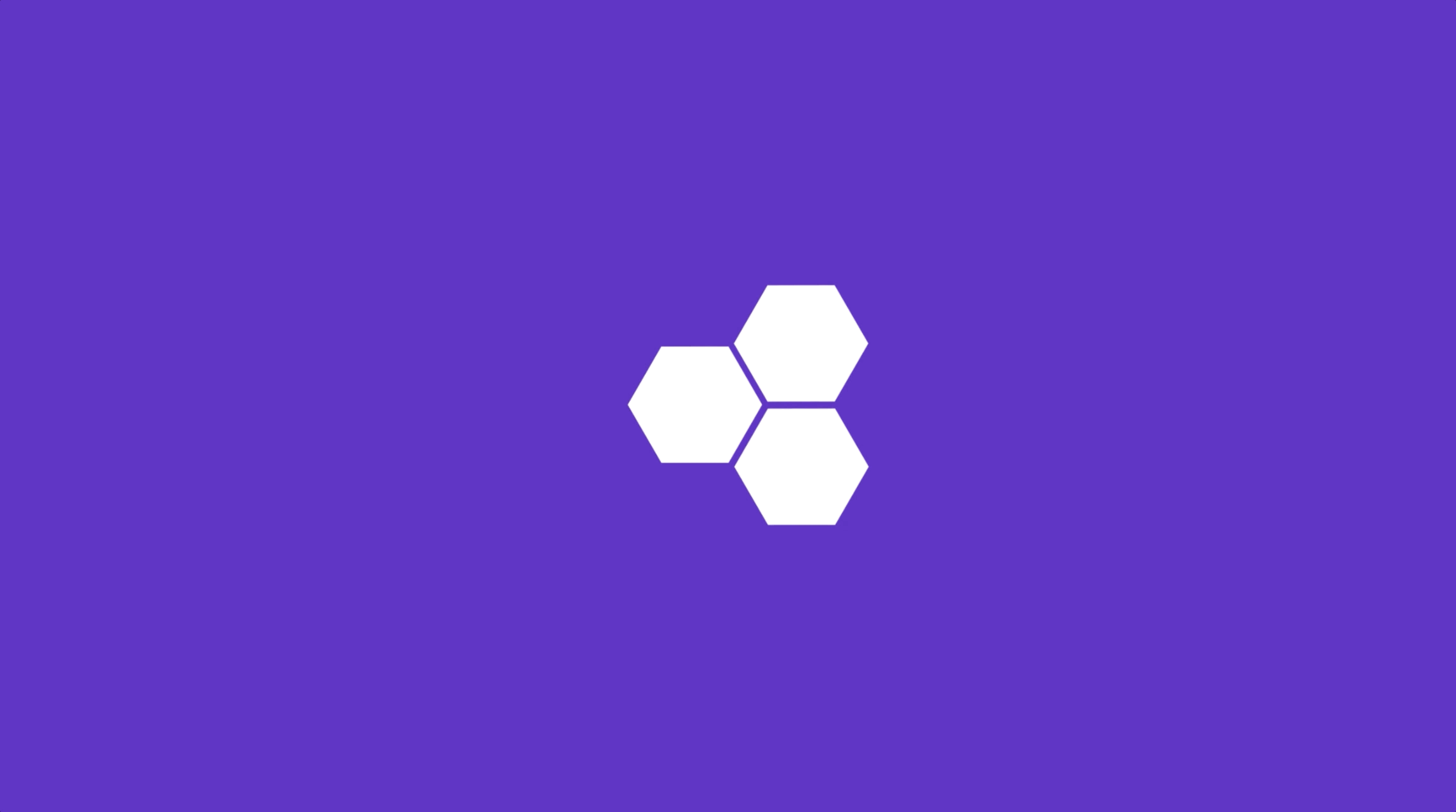
The hexagon in the Nitrogen logomark is a nod to the company’s origins with Riskalyze. Drawing inspiration from fractals—geometric patterns that expand within defined constraints—the design embodies the company’s focus on precision and growth. Fractals are known for their ability to create intricate, detailed patterns, and this concept guided the logomark's development. The result is a symbol of sophistication, technical expertise, and Nitrogen’s commitment to continuous growth and collaboration


Visual Language
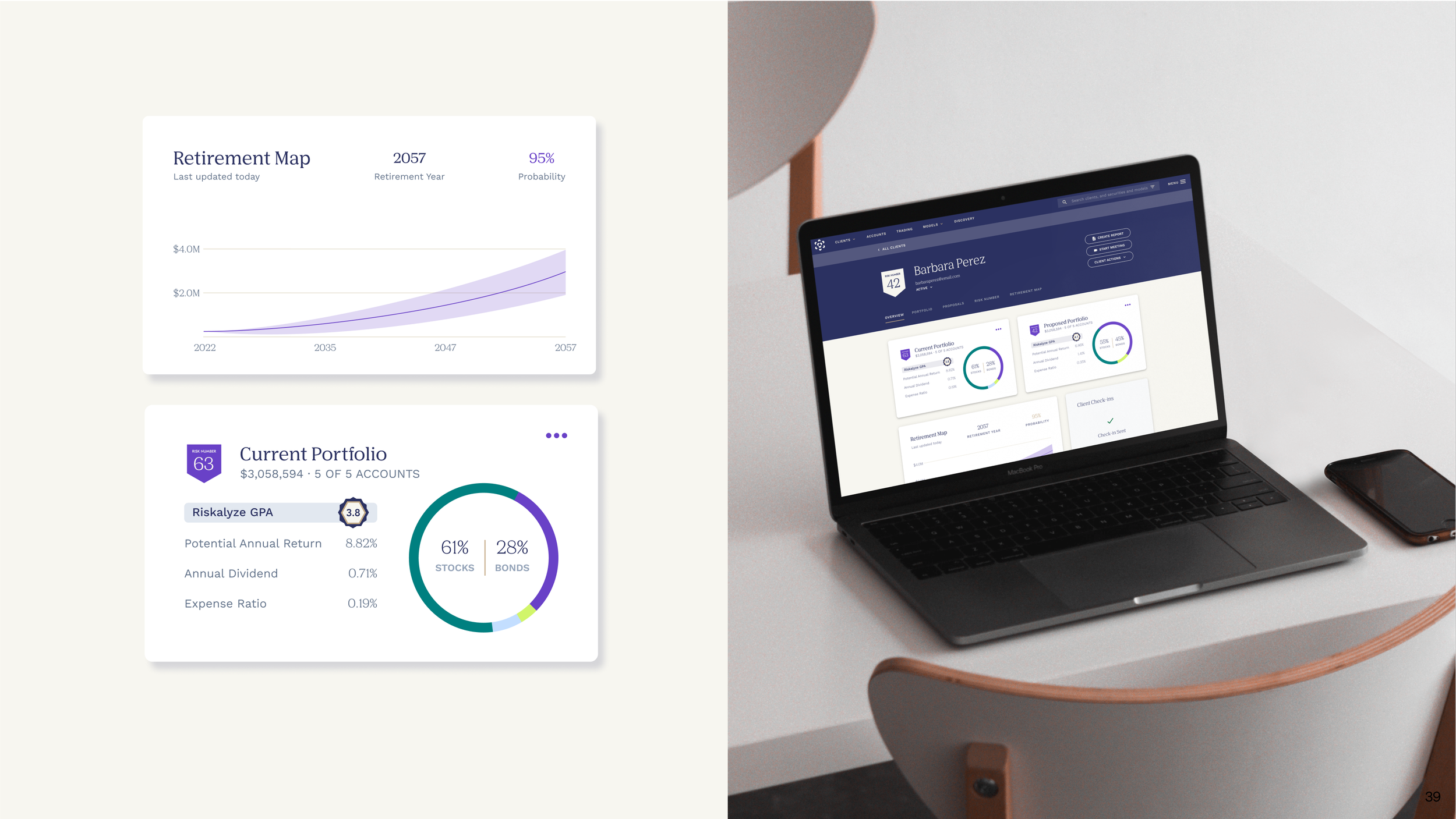
The tick marks highlight Nitrogen's dedication to in-depth, thoughtful analysis, reinforcing the brand's focus on accurate, detailed, and precise measurements. This element plays a key role in the visual language, emphasizing the brand’s commitment to providing valuable insights.
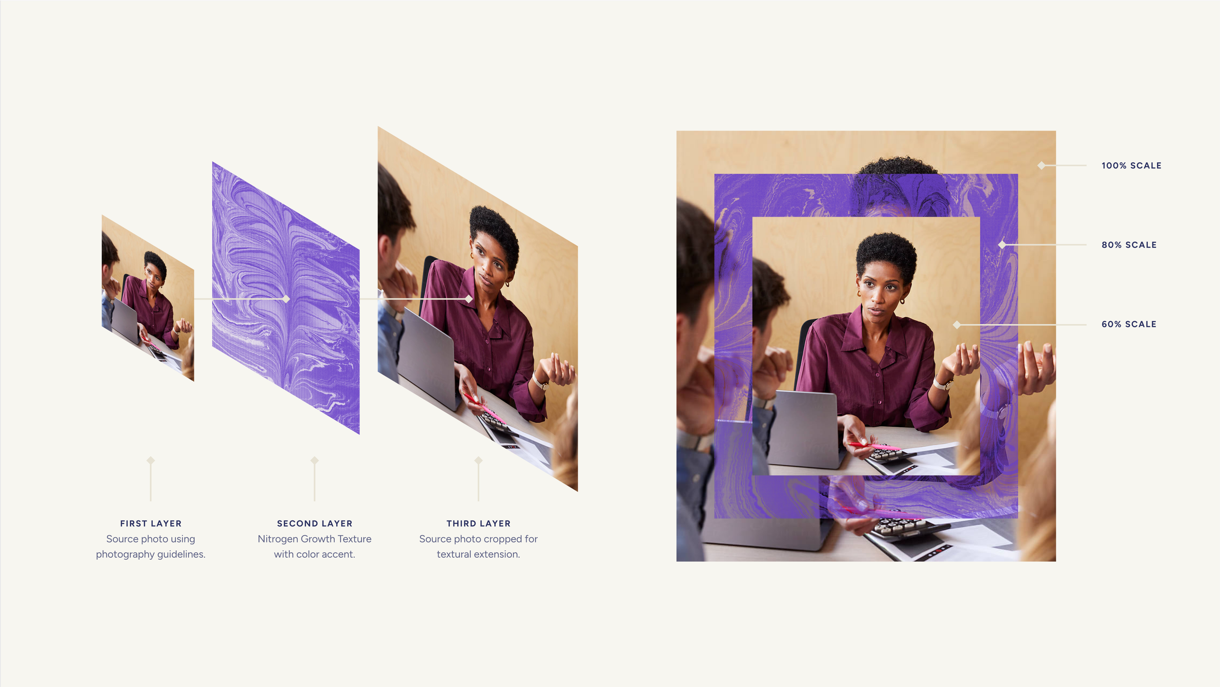
Textural photography tells the story of math in nature, growth, and multiplication. Images of natural elements and repeating patterns visually convey the themes of expansion and growth, further emphasizing the brand's core principles.